Onboarding
A page re-design that led us to a framework
As the lead designer, I iterated through the design process to re-design VS Code’s welcome page to discover a framework that could scale.
Looking at the Data
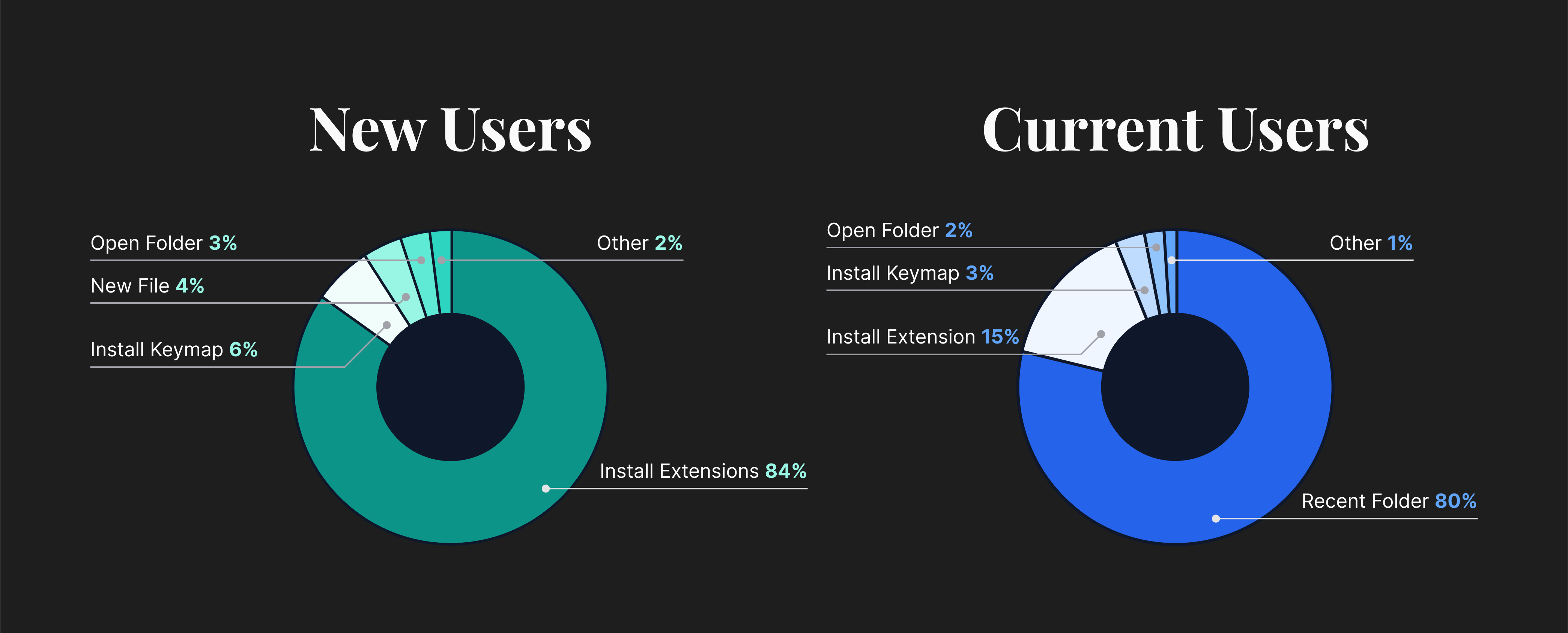
As I started looking at ways to improve the page, I began looking at the data to better understand our customer’s tasks. After retrieving the data, I mapped out the actions based on two segments of users: new and current. This provided exciting insights as the segments had distinct yet overlapping tasks.
Early Explorations
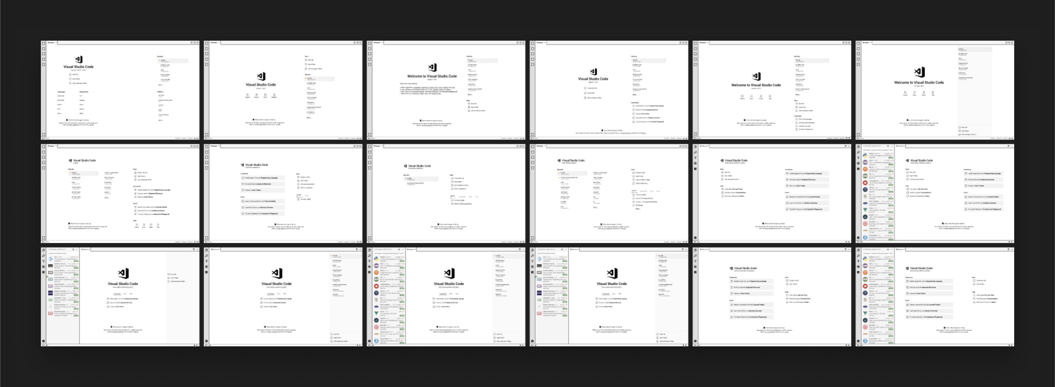
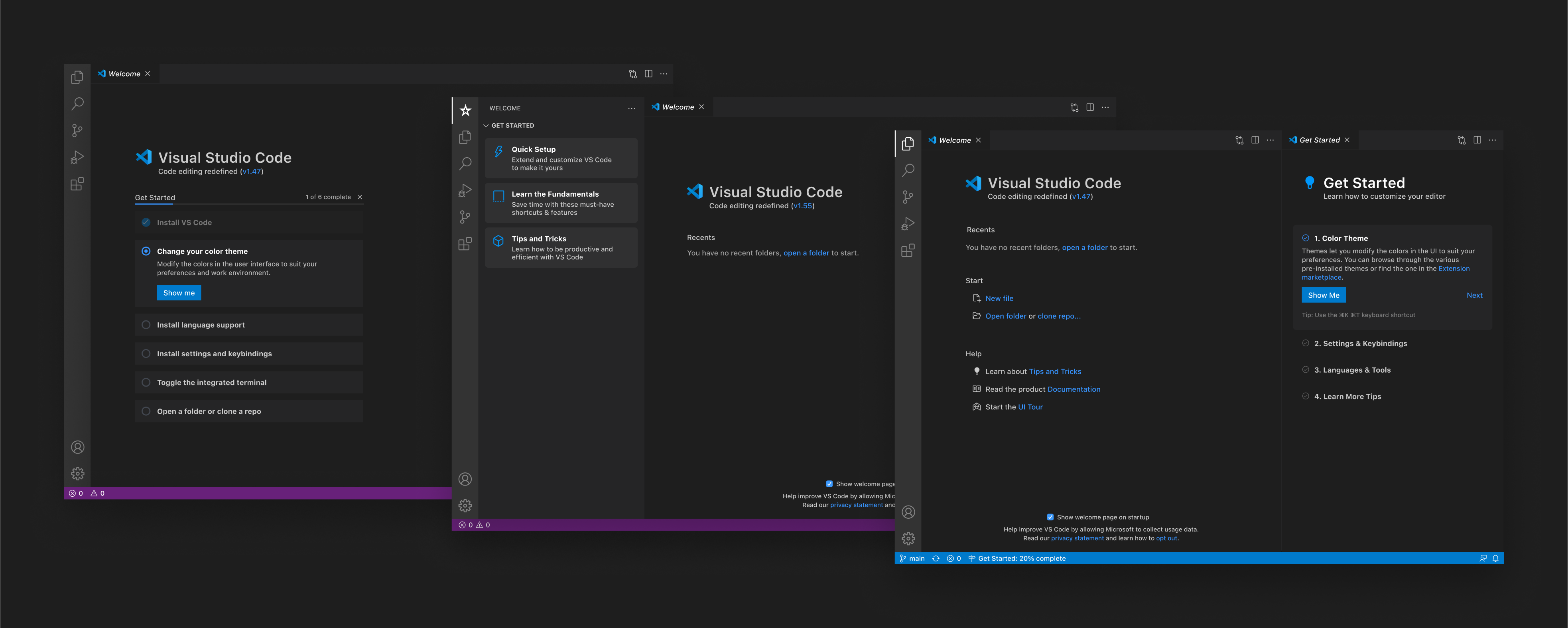
I began exploring various layout combinations where the content shifted depending on the number of recent projects in the list. The assumption, which needed to be validated, was that the more recent projects a user had, the more experienced or comfortable they became with the editor.
Listening to the Feedback
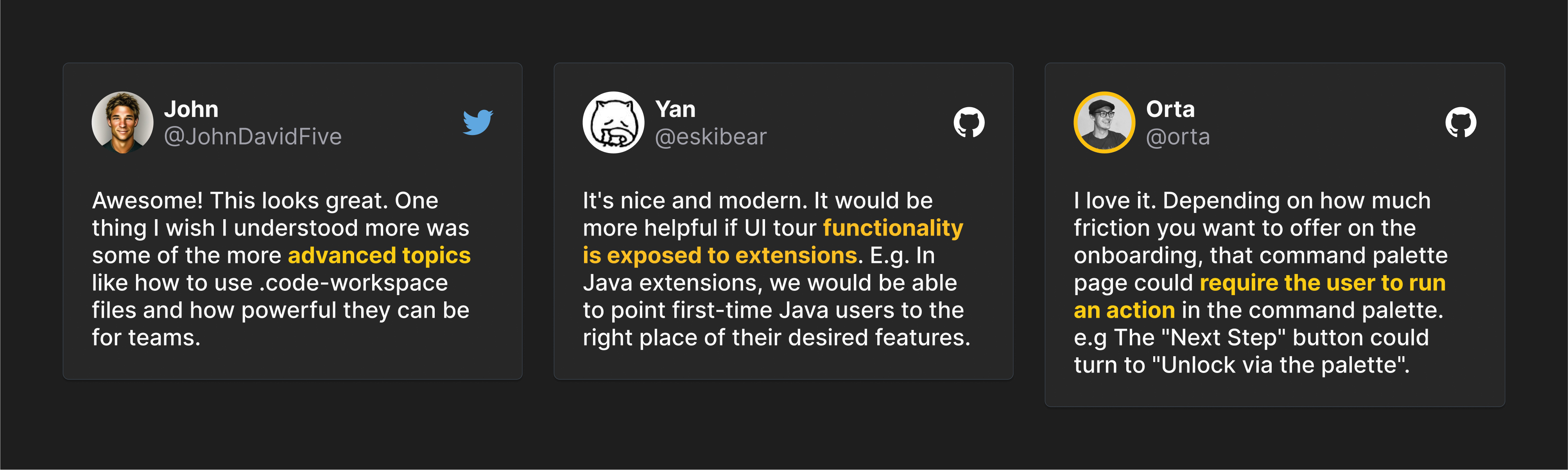
Once I created several variations, I started soliciting feedback from the community and began to open-source the design process. After posting the designs on GitHub, we started to see emerging themes in the feedback.
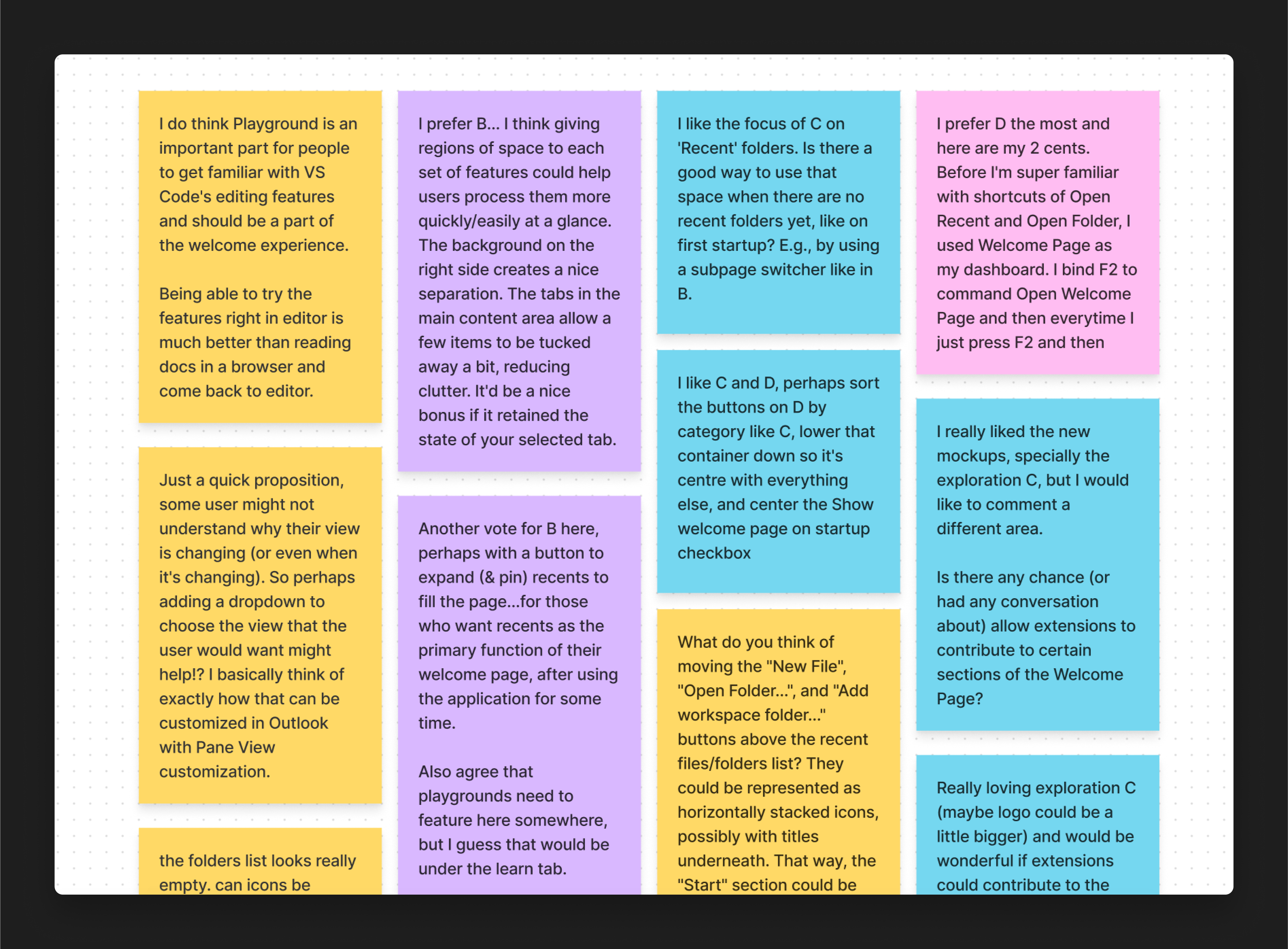
Given that our customers on GitHub represent only a subset of our customers, we conducted user concept tests to validate our ideas. We were surprised to find out that even though users preferred a particular concept, we didn’t solve any real problems. This remarkable insight prompted me to re-evaluate the problem I thought we were solving.
Pivoting
Our ultimate goal was to make it easier for new users to get set up with VS Code while empowering users to quickly switch between projects. We took a moment to survey the market and see what other products have done. We also looked at how extensions tried to onboard their users with their features, which hinted at their intent.
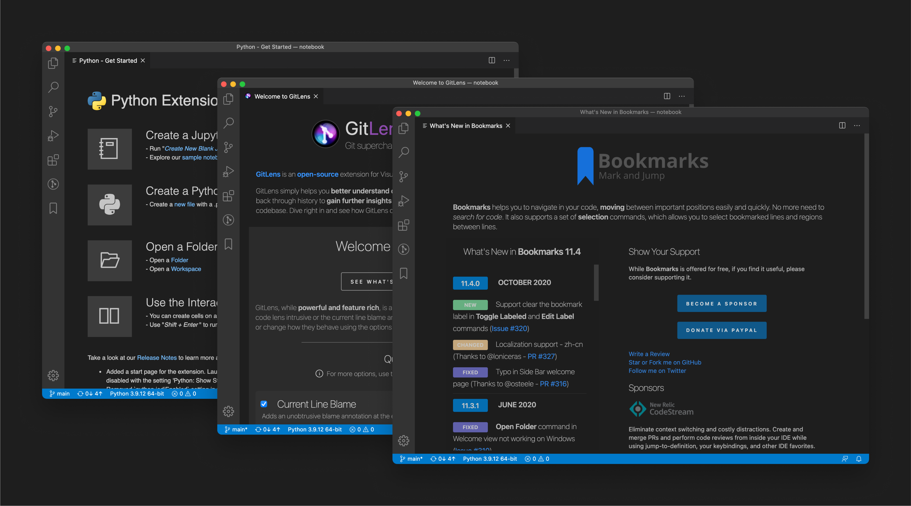
Creating the carousel
One typical pattern we saw during onboarding flows was for users to be given a tour of the product, typically via a UI tour or a carousel slide. We decided to try the carousel approach and gauge the customer feedback: experimenting in the open.
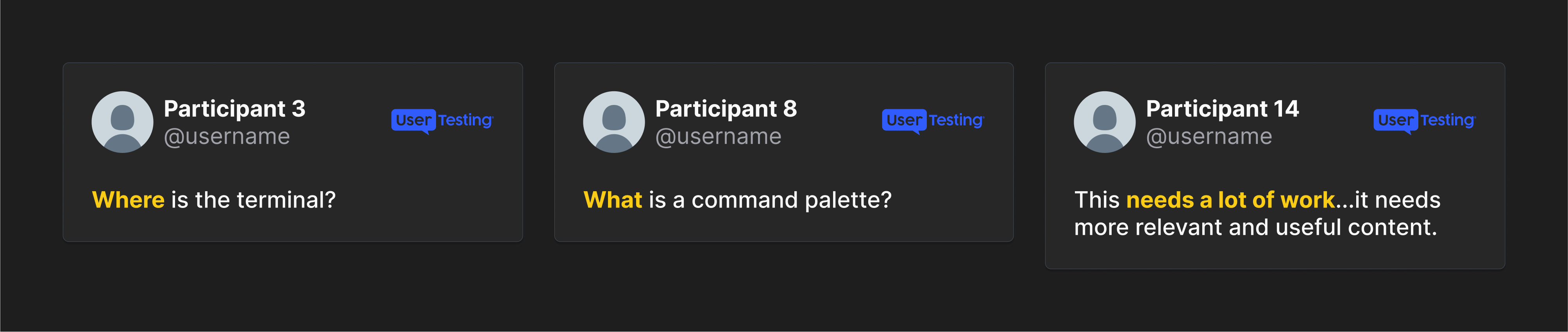
Unsurprisingly, the feedback on social media was quite positive, and customers started requesting advanced experiences to learn how to use the product.
However, we were stunned at the response once we started to test our concept in our research studies. Users either skipped the carousel completely (consciously or unconsciously) and couldn’t complete their tasks, which were mentioned in the carousel, defeating the entire purpose of the concept.
Pivoting…Again!
We returned to the drawing board with our concepts and tried an alternative method. During the concept tests, we realized that most users wanted to reference the onboarding screens, which gave us a hint to integrate them directly on the welcome page.
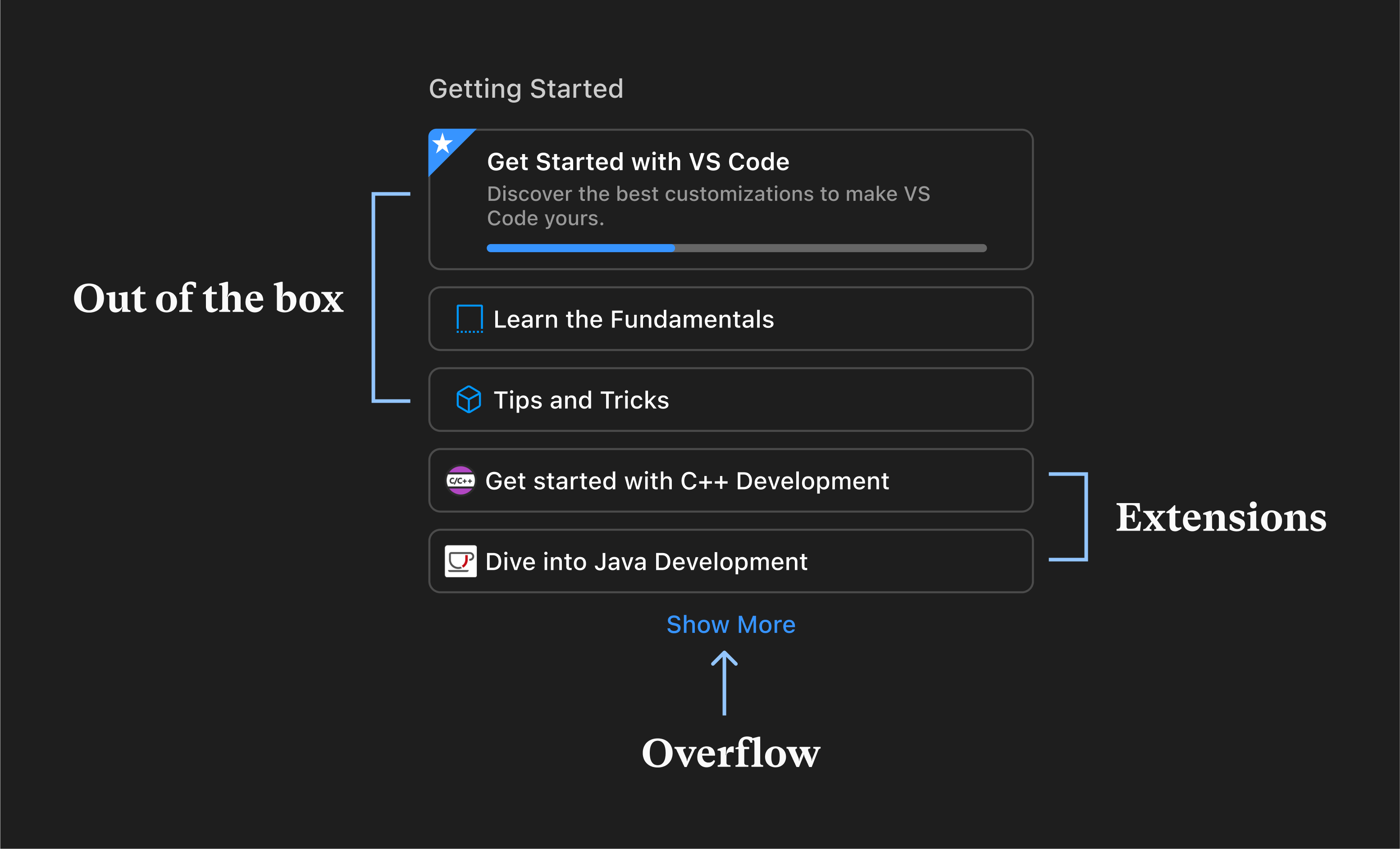
Arriving at our destination
It was clear that out of the various options we had explored, one stood out the most in terms of scalability. We wanted something that allowed us to swap out content (depending on the user’s experience) and allow extensions to leverage the same functionality.
After rounds of testing, we noticed that the cards concept allowed us to achieve our primary goal of keeping the content on the page while also allowing extension to display different content. If experienced users weren’t interested in the content, they could easily dismiss them and regain the space.
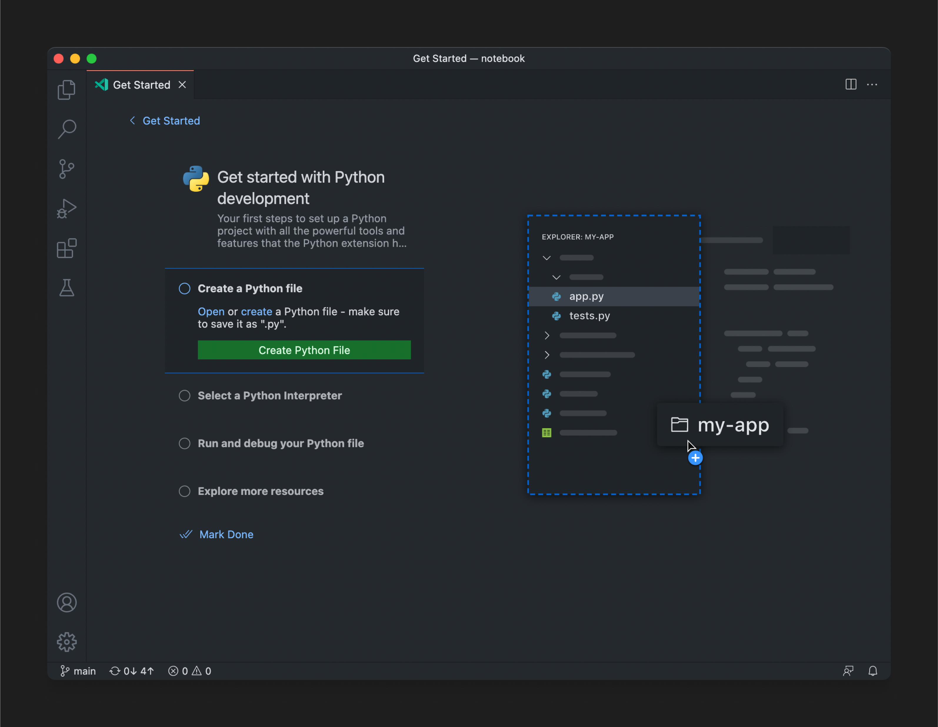
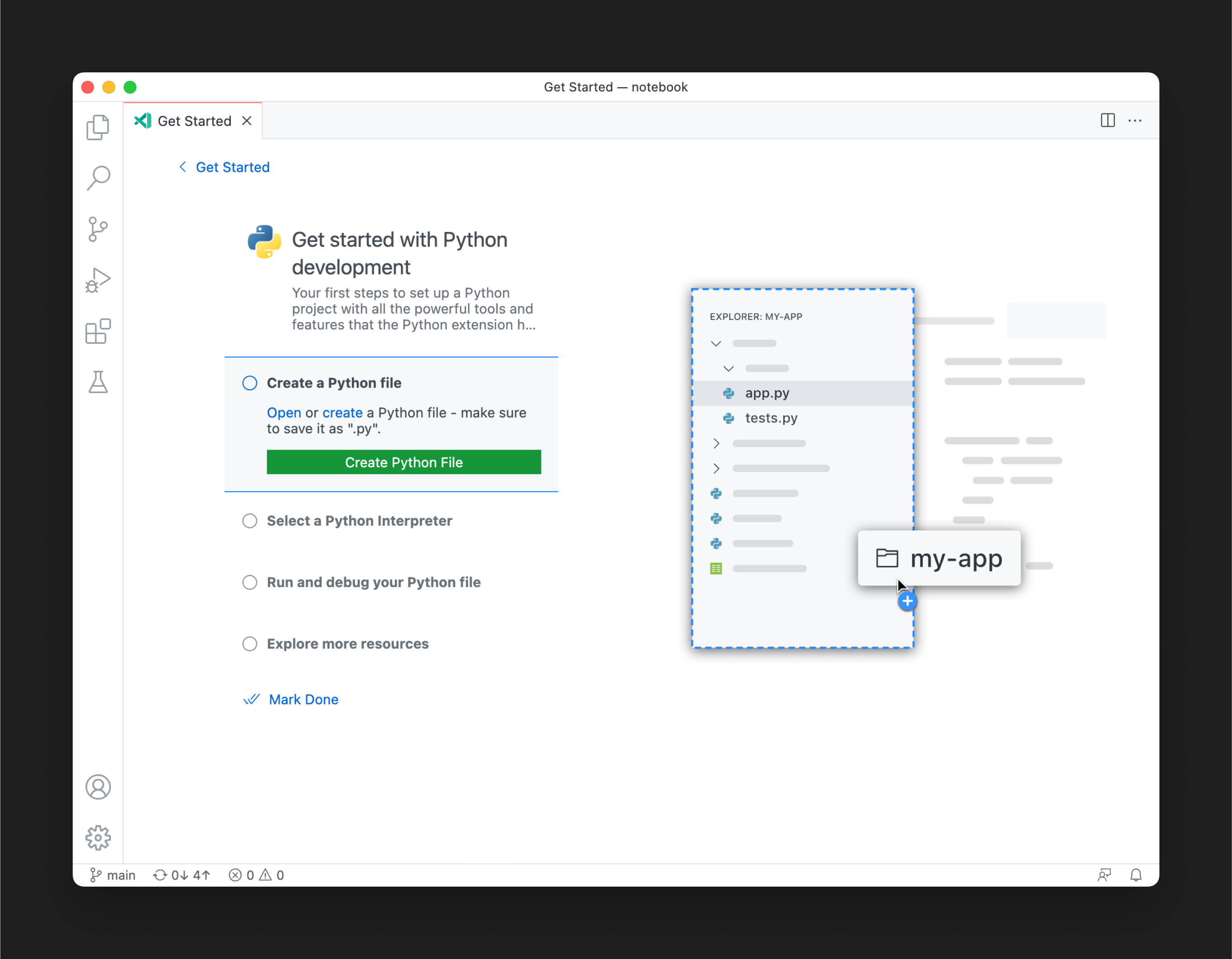
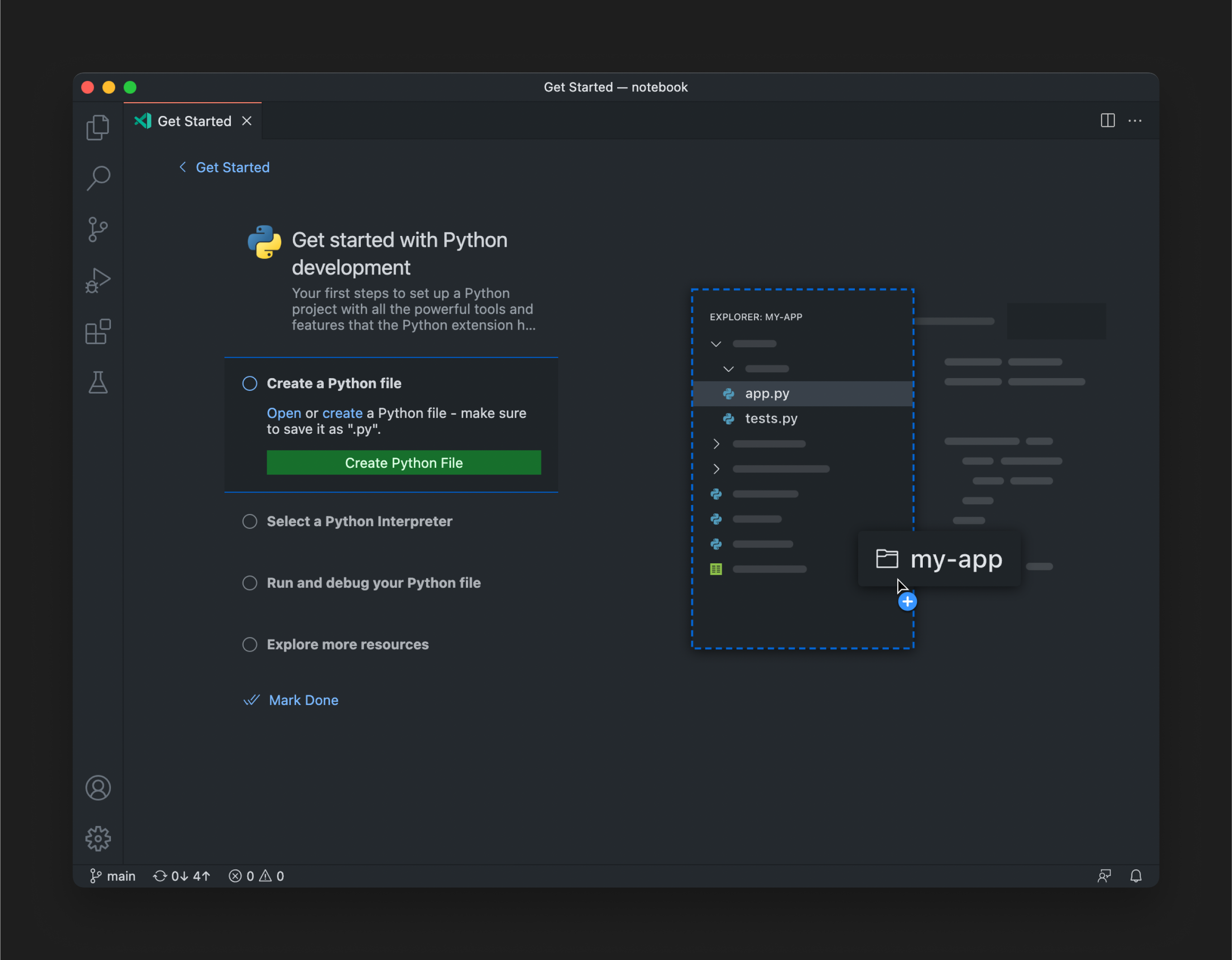
Dynamic illustrations
Since each walkthrough displayed different content, we introduced a new abstract illustration style to accompany the content. This uncovered a new issue with the colors used in the illustrations, as they needed to adapt to the user’s theme. We then discovered a way to make them dynamic and reference CSS variables in the SVGs.
Collaborators
- Jackson Kearl - Engineering
- Harald Kirschner - Product Management
- Steven Clarke - User research
- David Dossett - Design
- Lydia Chung - Design
- Lee Murray - Design Operations