Onboarding
A redesign that led us to a framework
An interactive replay of the onboarding concept, from welcome screen to UI tour
As the lead designer, I redesigned VS Code’s welcome page, and the process turned up a framework that could scale.
Looking at the data
As I started looking at ways to improve the page, I turned to the data to understand our customers’ tasks. I mapped the actions across two segments of users: new and current. The segments turned out to have distinct but overlapping tasks.
The product with the top most actions for new and existing users
New Users
New Users: Install Extensions 84%, Install Keymap 6%, New File 4%, Open Folder 3%, Other 2%.
Current Users
Current Users: Recent Folder 80%, Install Extension 15%, Install Keymap 3%, Open Folder 2%, Other 1%.
Early explorations
I began exploring various layout combinations where the content shifted depending on the number of recent projects in the list. The assumption, still unvalidated, was that the more recent projects a user had, the more comfortable they were with the editor.
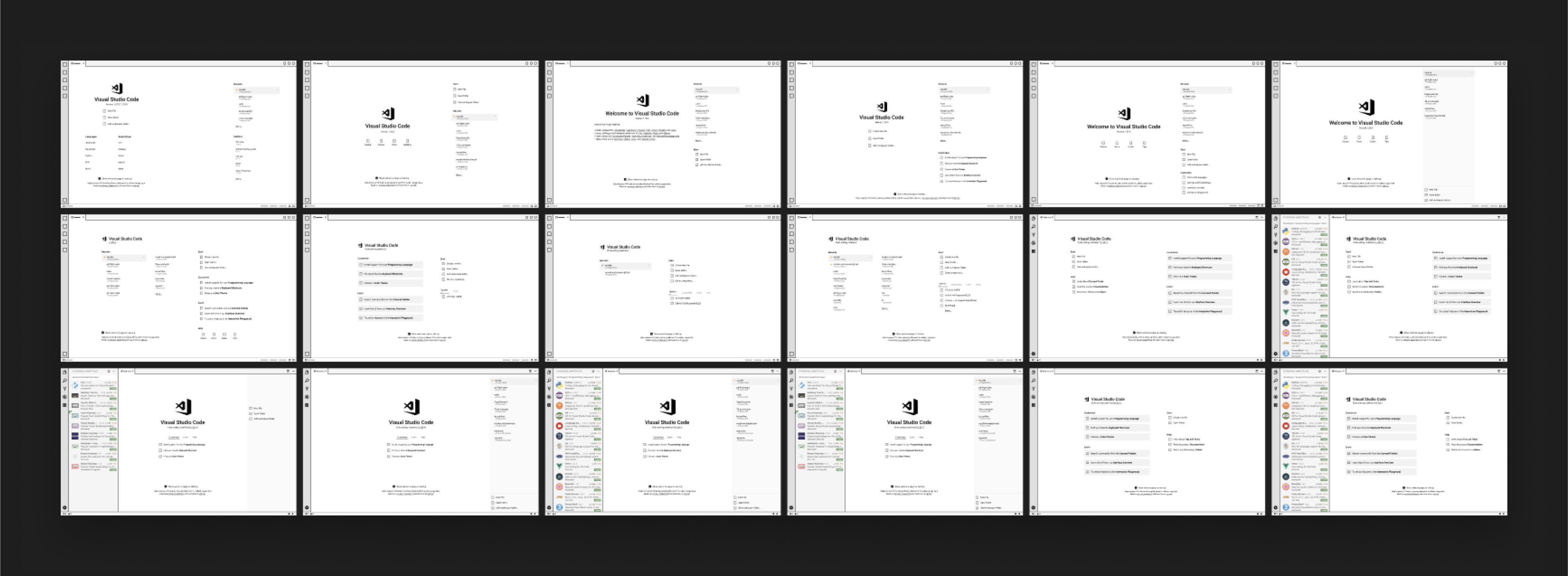
Eighteen layout explorations for the welcome page
Listening to the feedback
Once I had several variations, I took them to the community and open-sourced the design process. After posting the designs on GitHub, we started to see emerging themes in the feedback.
Community feedback from GitHub, clustered into emerging themes
Our GitHub community is only a subset of our customers, so we ran concept tests to validate the ideas. We were surprised to find that even though users preferred one concept, it didn’t solve any real problems. That sent me back to re-evaluate the problem I thought we were solving.
Pivoting
Our goal was to make setup easier for new users while helping everyone switch between projects quickly. We surveyed the market to see what other products had done. We also looked at how extensions tried to onboard their users with their features, which hinted at their intent.
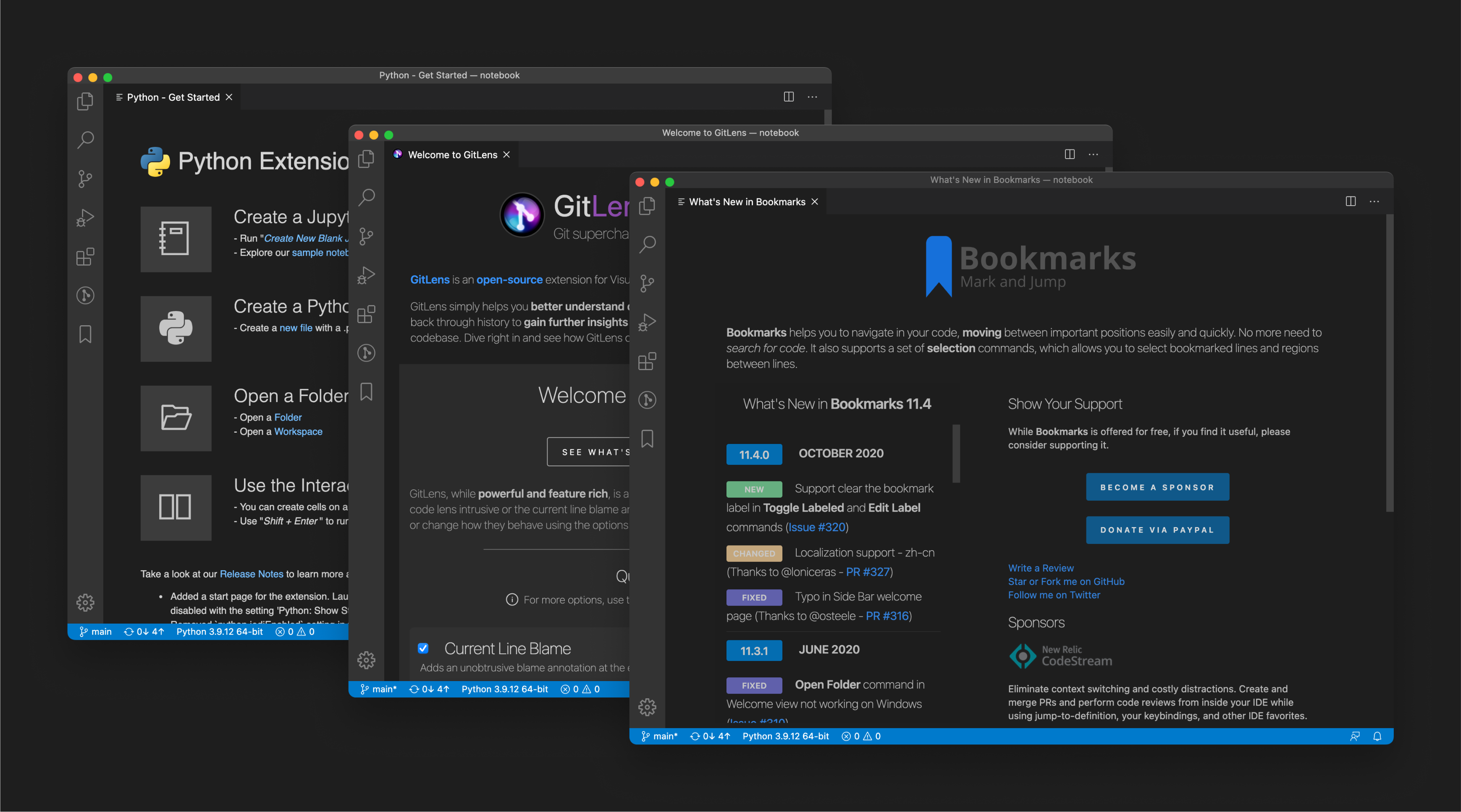
How extensions like Python, GitLens, and Bookmarks onboarded users on their own
Creating the carousel
One common pattern in onboarding flows was a tour of the product, usually a UI tour or a carousel. We decided to try the carousel approach and gauge the customer feedback: experimenting in the open.
Unsurprisingly, the feedback on social media was positive, and customers started requesting advanced experiences to learn how to use the product.
Awesome! This looks great. One thing I wish I understood more was some of the more advanced topics like how to use .code-workspace files and how powerful they can be for teams.
It’s nice and modern. It would be more helpful if UI tour functionality is exposed to extensions. E.g. In Java extensions, we would be able to point first-time Java users to the right place of their desired features.
I love it. Depending on how much friction you want to offer on the onboarding, that command palette page could require the user to run an action in the command palette. e.g The “Next Step” button could turn to “Unlock via the palette”.
But once we tested the concept in research studies, the response stunned us. Users skipped the carousel entirely, consciously or not, and then couldn’t complete the very tasks it had covered.
Where is the terminal?
What is a command palette?
This needs a lot of work…it needs more relevant and useful content.
Pivoting…Again!
We went back to the drawing board and tried another approach. The concept tests showed that most users wanted to refer back to the onboarding screens, a hint to put them directly on the welcome page.
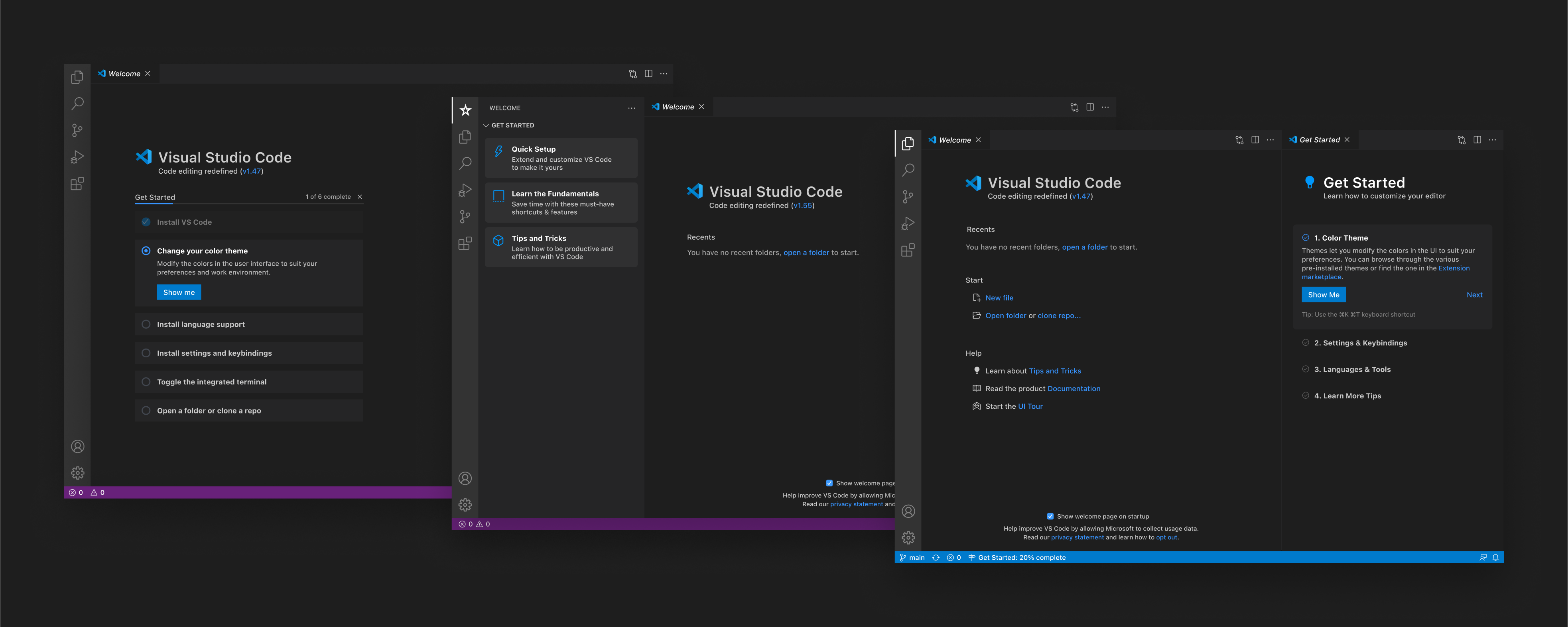
Iterating on where the onboarding checklist should live
Arriving at our destination
Of the options we explored, one clearly scaled best. We wanted to swap out content based on the user’s experience, and let extensions use the same framework.
The winning concept in motion: swappable walkthrough cards on the welcome page
After rounds of testing, the cards concept hit our primary goal: content stayed on the page, and extensions could contribute their own. Experienced users who weren’t interested could dismiss the cards and get the space back.
The card framework: built-in walkthroughs, extension contributions, and an overflow
Dynamic illustrations
Since each walkthrough displayed different content, we introduced a new abstract illustration style to accompany the content. That surfaced a problem: the illustration colors needed to adapt to the user’s theme. We then discovered a way to make them dynamic and reference CSS variables in the SVGs.
Drag the divider and the illustration pulls its colors from the theme
Impact
Once the walkthroughs shipped, the measures we had used to frame the problem started to move. More new users came back to the editor in their first days with it, usage of the onboarding content climbed, and extension authors took up the same framework to introduce their own features.
In addition to these metrics, I contributed to our open source community across issues, pull requests, and commits. Designing in the open meant the work was public from the first sketch. Explorations and feedback lived in GitHub issues, and I shipped changes myself instead of handing off specs, so the numbers below are my own personal metrics on the VS Code repo.